getting-started
For Designers ()
Chameleon consists of a toolset that helps you, as a designer, to create digital news media experiences at Mediahuis.
The design team uses Figma as the tool for all design related deliverables. The UX colleagues design their concepts and wireframes in this tool and our team creates and manages the styles, foundations and components so that we can create high fidelity user interfaces for the development teams. Because Figma provides possibilities for all phases of the design proces and it also has capabilities for prototyping, versioning and basic code inspect of components and styles in handoffs there is no need for any other tools. All designs can exist in the same environment and designers and viewers always have the latest version of the designs and the design system, making Figma the ideal 'one source of truth' environment for all our design work.
To get you up and running with the tool and within our workflow, follow these steps:
Create an account (if you don't have one yet)
You can use your Mediahuis e-mail address to create a new account on https://www.figma.com/ but if you were already using Figma before it is recommendable to use your existing (personal) account. The Mediahuis project will then just be added to your Figma dashboard, without you ever needing to switch between your different accounts.
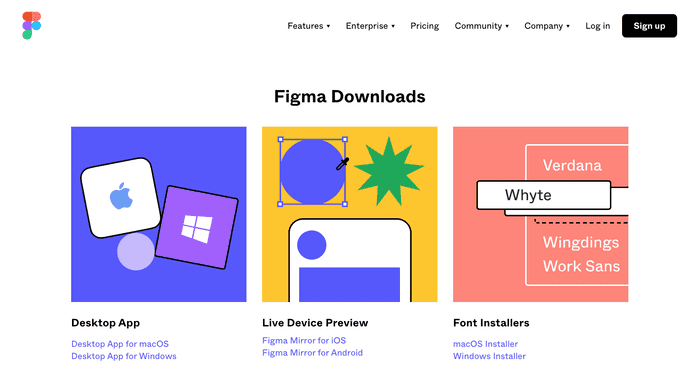
Download the app for Mac or Windows
Find the desktop app here: https://www.figma.com/downloads/. You can also download the mirror app for your mobile phone to check designs on your mobile screen.
Download and install brand fonts
You can find the brand fonts at https://chameleon.mediahuis.be/foundations/fonts/ and/ or https://drive.google.com/drive/u/1/folders/117ejMVIbTYcA1Myqo3yriLigc_mjpSuJ.
Please note: All licences are managed by the brand's digital leads. We use test licences initially for the design system designs. The Digital Lead of each brand will have to buy and manage each font license they need for all digital and print products.
Project Organization
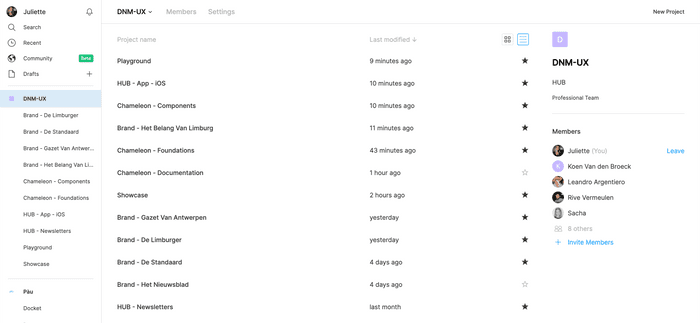
The Project folder is named DNM-UX. Click on it on the left side to find an overview of all the project folders. (You can view them as tiles or in a list).
We've decided to organize everything in different tiers, which reflects Chameleon's design system framework:
Chameleon - Foundations
At the base of our design system, we have Chameleon Foundations. In this project we manage 'Shared foundations' like system colors, spacing, image ratios etc. These styles lay foundations for our digital experiences which everyone should use and have to be shareable across all platforms and teams. Each brand also has their unique foundations: colors & typography each in separate files so that these files can be easily activated as libraries. When only designing for one brand you will just need to activate that brand's foundations library and the shared foundations. However other foundations like icons and illustrations are managed in one file for all brands to make them easily maintainable for our team.
Chameleon - Components
In this folder the 'CORE UI' provides all the main user interface components like buttons, form elements, list items, avatars, tooltips, modals, etc. The other folders contain what Figma calls 'components' but what our developers implement as patterns. They are actually collections of components. For example 'Components - Article Teasers' contains collections of image ratios, text blocks, labels and buttons. This way in Figma we can easily use these patterns as components to quickly build high fidelity wireframes and mockups.
Platform specific folders
All native components are managed in these type of files. 'Hub - App - iOS' for example contains elements specifically for the iOS app, like the native header, bottom navigation and list items.
Brand folders
Each brand has a dedicated folder in Figma. In these folder's we can publish the deliverables of designs so that brand's and business stakeholders have an accessable place to view these.
Playground
This is an environment for any explorations that are not ready to be placed in any of the more specific and public folders yet
Showcase
This is an environment for ready concepts and designs only, specifically so they can be publicly accessable for stakeholders to be viewed and used. Here we for example show the HUB hand book with examples of the usage of the design system and white label wireframing for the app designs. We also place files here with mockups that brand's can use for publicity etc.
Adding or adjusting designs in existing files
Adjusting library files
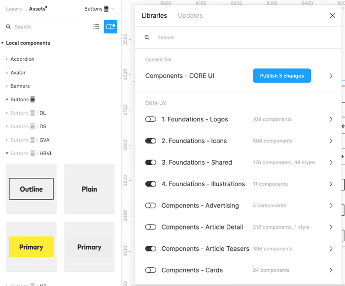
There are no different types of files in Figma for library/component purposes versus design (using library components) purposes. However we do make that difference in the project by keeping files separated for both those purposes. The names of the files show this. All files named "Foundations .." contain the master styles. All files named "Components.." contain master components. Those are the libraries that can be published and activated within other files. If you want to make changes to library styles or components you can do this directly in these files and publish your changes. Once you made an adjustment either a pop up at the bottom right of your screen will appear to "publish" or you can publish on the top left side of your screen under "Assets". There will be a dot indication if there are any unpublished assets. Click on the book icon to publish all your changes.
Adjusting design deliverable files
In folders like the brand folders, playground and the platform specific folders you can find the files that provide design concepts and deliverables: wireframes, mockups and files for handoffs. If you need to make changes in these files just open this file and check for library updates first. All changes in the library files will automatically pop up in these files when the styles and components are already in use in the file. A prompt at the bottom right screen will ask to accept the changes. Or you can update the file from the left panel under 'Assets' (same proces as with publishing). Here you can also activate more or less libraries, depending on which styles and components you need.
Adding new designs and new files
Try to always start your exploration in the playground environment. This way we can keep the design system files clean and organised.
If you create deliverables that are not part of the platform handoffs you can move your designs to 'showcase' when they are ready to be viewed by stakeholders.
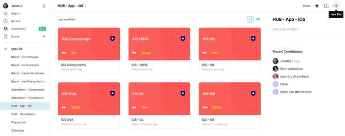
For all platform related designs the files can be created in those folders. For the iOS app we'll create the concept of the app design in the iOS folder first. The handoff of the overview sheets and full flow of the app will then be placed in the brand folder so that the stakeholders of the brand can view the designs in their designated folder.
You can create a new file by clicking on the icon at the top right of your Figma dashboard. (f you don't see this option it could be that you don't have the right permissions yet. Contact Rive, Leandro or Juliette to gain the right permissions.
Fila naming
We name all files following the below naming convention:
[Project Name] - [Feature Name]
Example: Foundations: Foundations - Icons
Decision making
Changes to the library (design system) files of brands like changes in color foundations, typography, buttons, should always be done after consults with Brand Digital leads. The news products are their products so they decide the visualisation. We just provide the digital building blocks and advise about the most optimal visualisation of digital products.
Once both digtal lead and design team agree on visualisation elements or changes to existing elements always make sure to also consult with our developer(s) (and other related developers). Our team's developer(s) create the foundations (tokens) and components of the design system and we should always stay in sync.
Handoffs
Handoffs of the design deliverables are currently created in Zeplin. We are transitioning this to Figma. This section of the documentation will therefore be updated asap.
Last but not least: Communication
Good communication is the key to the succes of the design system. We communicate about our design decisions frequently within our own design system team, either physically or through slack. And we sync with the UX team biweekly. For communication with our stakeholders there are several different dedicated slack channels.
Here is a list of the slack channels for stakeholders:
We also have a general intake email adress where you can reach out:


